A well-designed website, that transfers into mobile visualization, is crucial to growing a business.
A website is the online location of your brand, regardless of if you have a physical store or location. It is key that your website appropriately reflects your brand, creating a bridge from your physical location to your online one.
Your healthcare website offers customers a possibility to explore your product or service in the comfort of their homes or wherever they are. Therefore, a website experience should be pleasant and engaging for visitors.
A website adds to your brand’s trustworthiness and professionalism. You should consider what is the first thing you want to showcase when someone visits your website, the tone of the content, and how the colors add to that.
We’ll go through 12 yoga websites to show you great examples and ideas of how you can present yours to the world.
1. Boho Beautiful Official Yoga Website
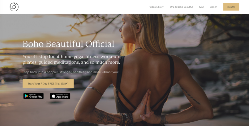
Boho Beautiful is a yoga and travel brand that began that focuses on creating content that has a positive impact on the mind, body, and planet. They seek to transmit conscious living based on the mantra “your decisions today will define your tomorrow”. The brand began without a logo and has evolved to a complete brand image.
Key Yoga Website Design Characteristics
- Their one-line icon logo symbolizes a world, and connection, in line with the brand’s values
- Simplicity offers a minimal, timeless, and fresh feel
- The use of a neutral palette and earth tones is a direct reference to the conscious living they transmit in their content
2. Alo Yoga Website
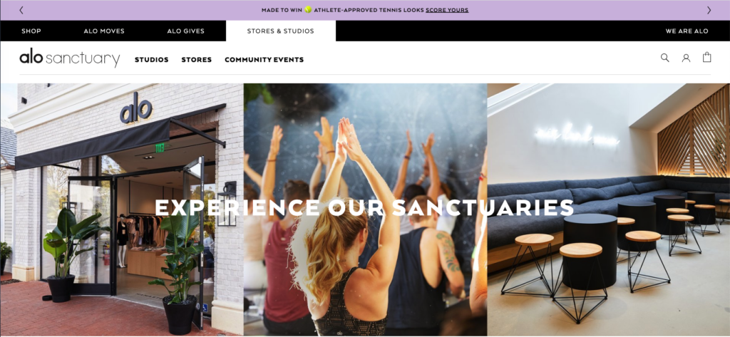
Alo Yoga is a yoga clothing and athleisure brand that offers a lifestyle based on movement while looking your best. The brand is a 360-content design that ranges from YouTube videos to curated content on social media. They offer skincare and beauty products that complement the lifestyle they promote. They have grown by offering free online classes, working with influencers, and having aesthetic looks for every season.
Key Yoga Studio Design Characteristics
- They offer a wordmark that’s simplistic, elegant, and timeless
- The bold font while making no use of capital letters offers a playful, young, and strong image
- The minimalist design and black and white use project a high-end feel that can easily be transferred to their many lines of products, while offering a sophisticated look and design
- The pop of color on their website is reserved for the brand new items while keeping an overall neutral background
3. Glo Yoga Studio Website Design
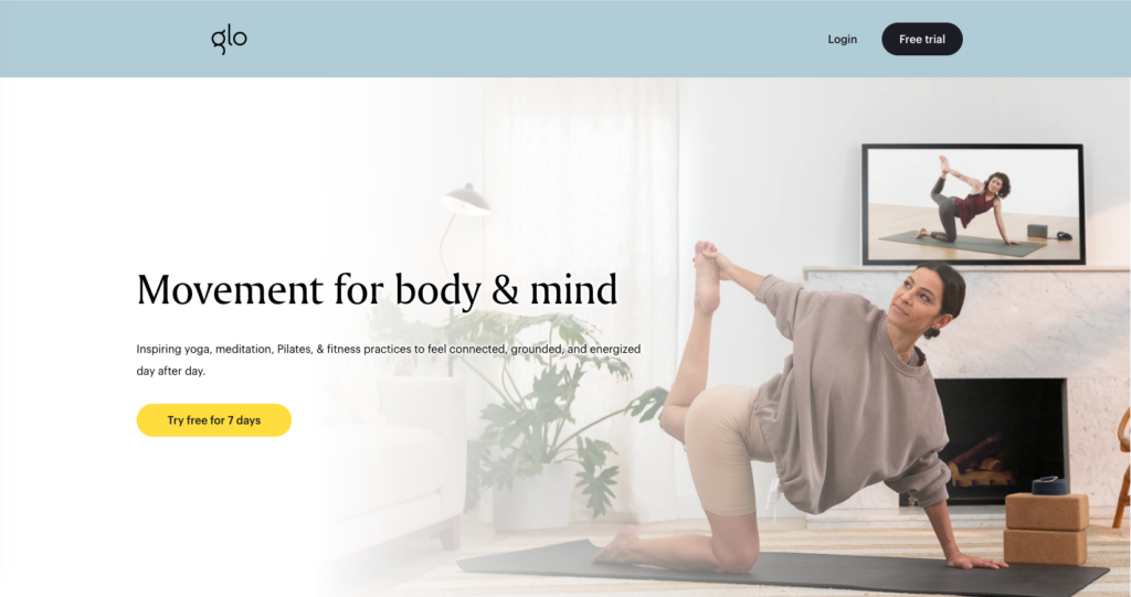
Glo Yoga is an online yoga platform designed for real people so they can fit yoga into their schedules. They offer a range of yoga classes for all levels of experience. The platform also offers personalization to cater to specific tastes and preferences. The website is straightforward and offers a glimpse of the classes and their teachers.
Key design characteristics
- They stick to neutral tones, with a glimpse of earth tones within their photos which offers a tranquil environment, despite there being a lot of information on the website
- The bright yellow reserved for calls to action makes it visually effective
- The deconstructed G icon offers a modern look to it
4. M.B. OM Website Design
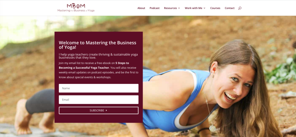
M.B.OM Yoga was founded by Amanda Kingsmith, a yoga teacher graduate that holds a podcast in addition to her website. The goal of this yoga teacher is to help other yoga instructors turn their yoga practice into a profitable business. She offers a community, guidance, and accessibility for all-level yoga teachers to get educated and connect to the business side of it.
Key design characteristics
- The website is inviting from the beginning, through a smiling photograph and a welcome message
- As you scroll down, it’s clear the purpose of the page, and the community it provides
- The burgundy hue adds to a level of high-end content while keeping it inviting through the various photos and wording of the pages
5. Dylan Werner Website Design
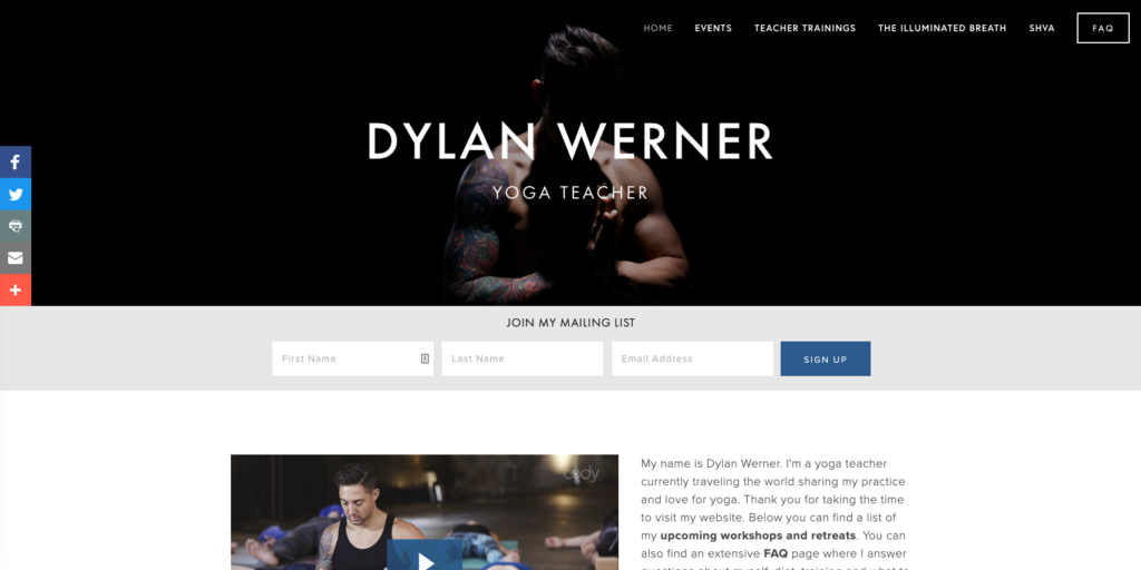
Dylan Wener brings a darker theme to the industry, catering to the male audience in a commonly female focus industry. Dylan Wener is a yoga teacher who shares his practice by traveling the world and offering retreats as he goes.
Key design characteristics
- The website offers a serious and professional feel
- It’s a simple website, heavy on images and videos, with minimal text content included
- The “show me don’t tell me” is heavily implemented through social media content display and videos
- The page focuses on promoting upcoming retreats and events and offering an invitation to any visitor to the website
- It’s simple, monochromatic with a pop of color highlighting the events, and effective to transmit its message
6. Wanda Badwal Website Design
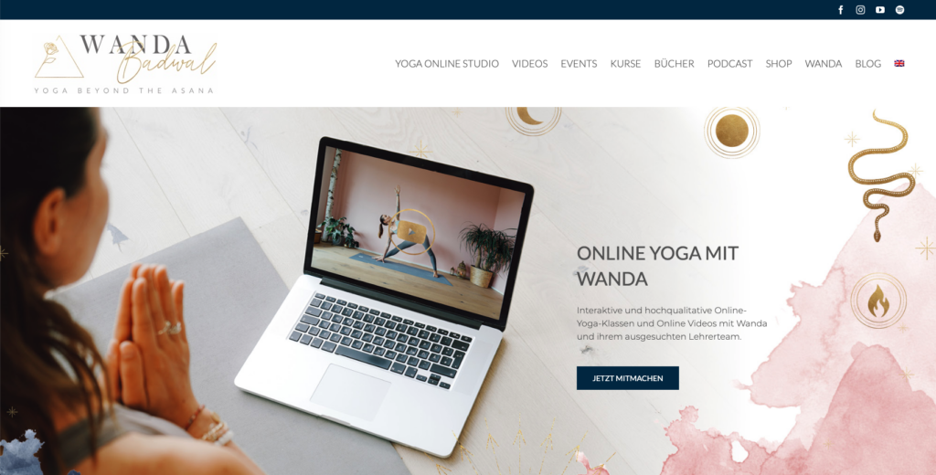
Wanda Badwal is a yoga teacher that transmits a lifestyle brand. She offers a free class video when you sign-up for her newsletter, which invites people to join in. She offers a comprehensive yoga world for anyone interested. She shares her story, her yoga teacher journey, events, podcast, and online classes.
Key design characteristics
- The website is quite extensive and comprehensive leading the visitor through everything this teacher has to offer
- The mix of gold with pale pink and a neutral backdrop offers an elegant and welcoming feel to the website
- It is inviting and has many user-interactive features so you can take your time exploring the website
7. Kristin McGee Website Design
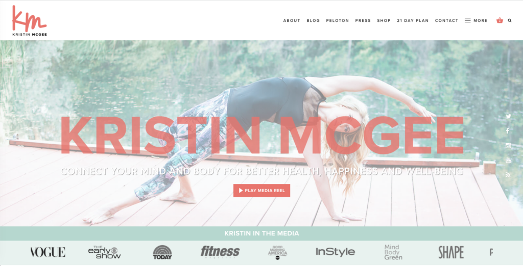
Kristin McGee is a celebrity yoga teacher and Pilates instructor. She is considered a pioneer in the yoga and wellness industry. She is a recognized author in the subject and has made herself a name by offering fun, cool, and accessible classes.
Key design characteristics
- The website instantly offers a call to action by featuring a video, which invites the visitor to play it, this is a good way to engage
- The green and tangerine colors offer a playful feel
- The branding is the personality yoga teacher, which is heavily emphasized throughout the website, inviting visitors to know more about her
- The website also features her writing and content, connecting the visitor more with her personality
8. Wellpreneur Website Design
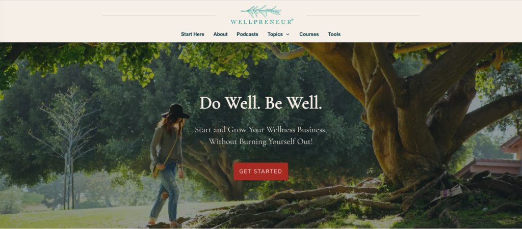
Wellpreneur is a company that caters to the wellness industry by presenting business courses and templates that can help them grow. The company, founded by Amanda Cook, has been around since 2012 and seeks to empower business owners in the industry to make a living out of it without burning out.
Key design characteristics
- The website transmits a calm environment for the visitor, grounding the brand in nature, which is one of the core values of wellness
- Despite it being a business focus website, it leans towards wellness through its simple and neutral design
- The website quickly shows what it’s about, and presents the visitor with a call to action
- The muted red emphasized the calls to action presented on the website, without disrupting the calm feel
9. Yoga with Adriene Website Design
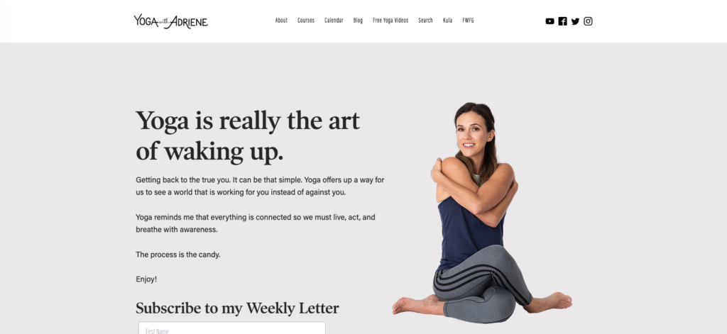
Yoga with Adriene has become one of the most popular YouTube channels in the last few years. Founded and run by Adriene Mishler this brand offers an online community of over 11 million subscribers. It offers a paid program with exclusive classes, and free online videos through its YouTube channel.
Key design characteristics
- The website is welcoming and inviting, the text presented instantly offers a fun and casual feel
- The neutral tones add to a calm website and experience
- The website focuses on showcasing the community and different available content options
- It is a simple, elegant website with a hint of fun elements included in the text content and the logo
10. Elena Bower Website Design
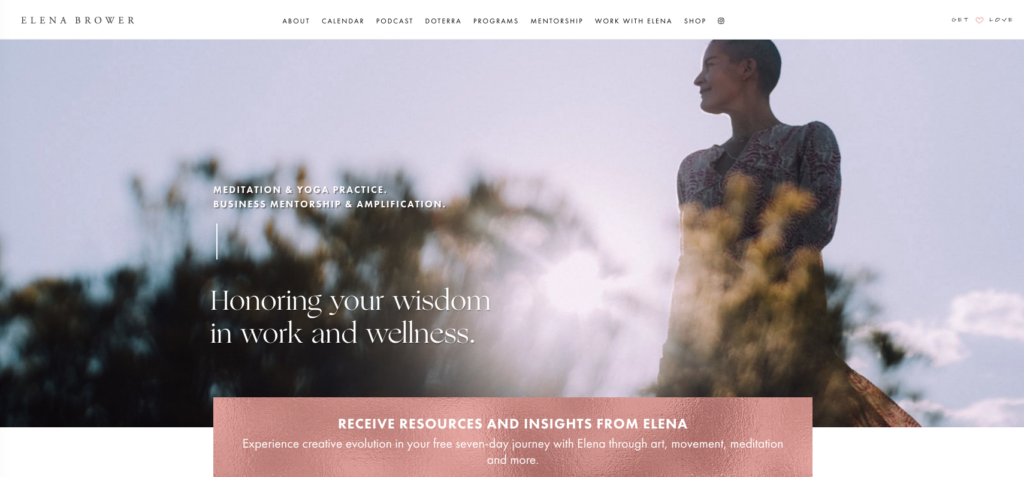
Elena Bower is a mother, yoga teacher, and artist that has been teaching yoga since 1999. She is the host of a podcast and a bestselling author. She is also writing poetry collections, and her yoga and meditation classes are featured on other yoga streaming platforms
Key design characteristics
- The website offers whimsical elements that reflect the mystic embodied by the yoga teacher
- Its earthy tones and muted pallet add to a natural feel, which is referenced along the website’s content
- The clear lines in the font type offer a minimal image
11. Gypset Goddess Website Design
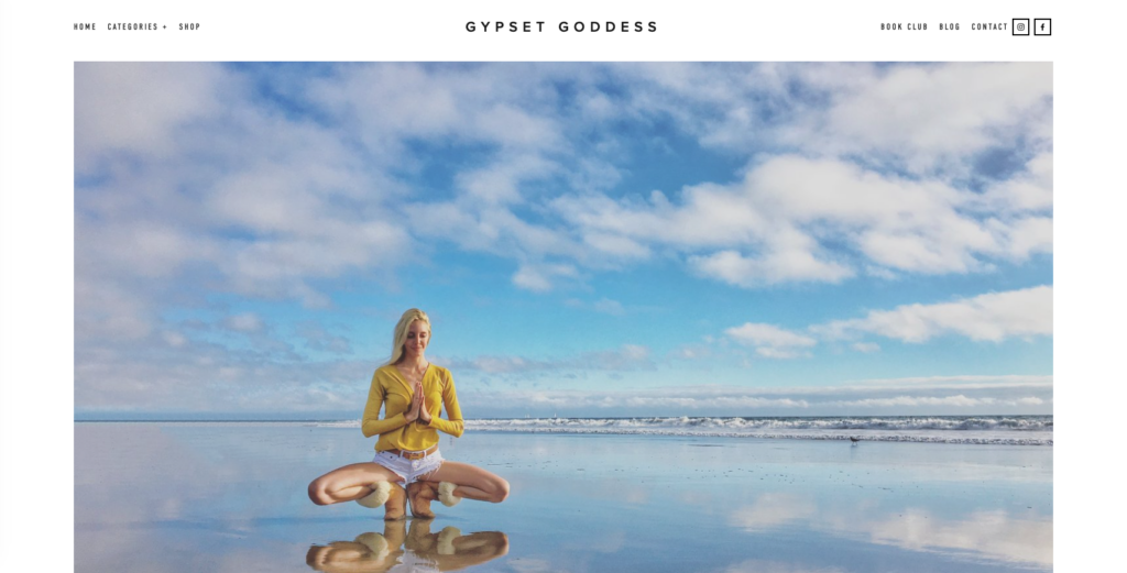
Gypset Goddess is a yoga teacher that preaches a lifestyle for jet setters and bohemians. The content of the website features a blog and travel recommendations, yoga is one of the pillars it caters to within a broader content.
Key design characteristics
- The neutral tones let the photographs shine through
- The website centers around personality and lifestyle content
- Yoga, fashion, and traveling are emphasized through photos, videos, and little text on the website
- The focus is on the brand with little personal information
12. The Thriving Yogi Website Design
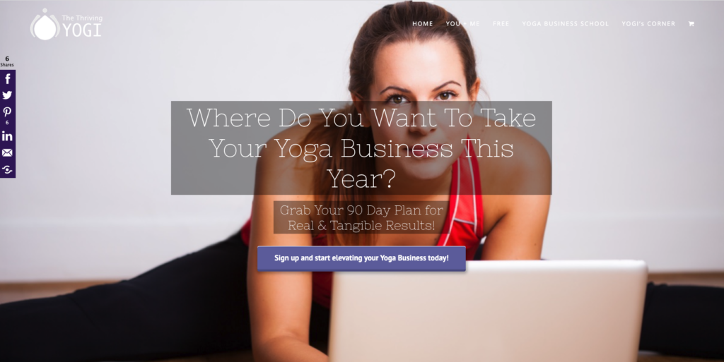
The Thriving Yogi offers business guidance, coaching, and resources for yoga teachers seeking to take their business to the next level. The company offers paid courses as well as free resources, making it accessible, and engaging.
Key design characteristics
- The initial statement of the website offers a bold statement
- The use of a non-common color in the industry, such as purple, signifies a distinction that transmits professionalism and seriousness
- The website is invited and divided into sections making it a pleasant experience for the visitor
Final Thoughts
In a market that offers such a broad type of services and diverse ways to tackle it, you want to make sure you’ll find the key element in your brand and capitalize on that.
A well-designed website, that focuses on promoting your services and values will always grow your business, it doesn’t matter if you’re getting started, or if you have decades of experience.
As we’ve seen throughout this article, there are multiple ways to showcase our personality and purpose in your design. You can opt for a minimal approach that invites people to want more or focus on the community you offer.
Best of luck!

