Logo designs are a crucial element of branding. In a digital-first world where everything’s at our fingertips, your custom healthcare logo design must communicate accurately your values, to draw people into your business. A logo design introduces your brand’s identity to customers, we must transmit the right message when people come across us. Therefore, the logo design elements of your image should be carefully crafted to increase brand engagement, a brand that translates easily into different platforms and creates an impact on viewers.
It can be overwhelming, which is why hiring professionals instead of using a free logo maker or seeking free logo design templates is the best course of action. Working with a professional agency is the best way possible to achieve a brand image that accurately represents your company.
We hope this article offers some helpful logo ideas, so you know the elements you want your logo to include, and how you want to use them to promote your brand.
We’ll go through 12 top pharmaceutical, biotech, and life science companies to show you great examples and ideas of how you can craft your logo image to create the perfect logo.
1. Novartis Logo
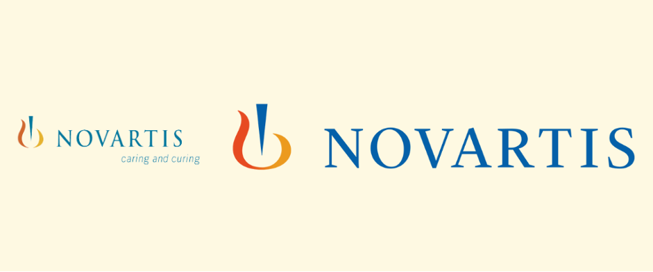
Novartis is one of the leading pharmaceutical companies in Switzerland and specializes in oncology, dermatology, and neurology. The company name is composed in a simplified form by the words “Nova Artes” which translates roughly into new arts or innovation.
From 1996, up to 2017, the company used the logo on the left side. While the change to the right-side logo is subtle, the use of a deeper pallet emphasizes the emblem, making it recognizable, and easy to identify.
Key Pharmaceutical Logo Design Characteristics
- The tricolor pallet keeps the logo professional, timeless, and elegant
- The accent colors are presented only in the icon
- Clear spacing between letters makes the company name stand out
- Rebranding – deeper color pallet, no tagline
- Icon has an abstract meaning in line with the brand identity
2. GSK Logo
Glaxo Smith Kline is one of the world’s top British companies, a leading research-based pharmaceutical committed to improving human life quality.
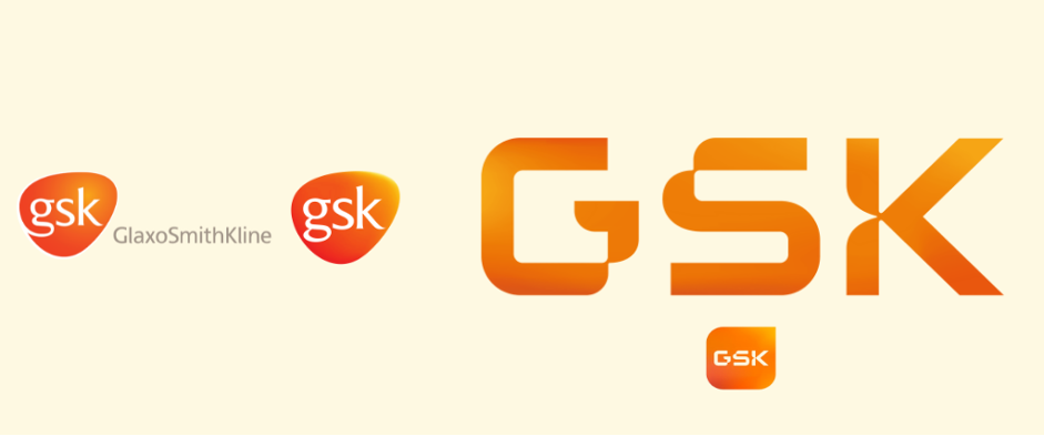
This past June 2022, GlaxoSmithKline officially became GSK as it shed its consumer unit (Haleon) and revealed a new brand identity, focused on technology and transformation.
From left to right we can see the evolution of the brand’s logo, from a tablet-shaped emblem to a standalone uppercase logo that conserves the distinct orange.
Key Pharma Logo Characteristics
- The gradient orange keeps the new logo rooted in its origins while offering a timeless, modern look with a hint to the tech industry
- The standalone uppercase offers a stronger feeling
- The abbreviation preserves a symbol already known to consumers
- Rebranding – in the name and font typeface
- While it has no icon, it transfers easily into social media platforms with an inverted look
3. Aris Logo Global
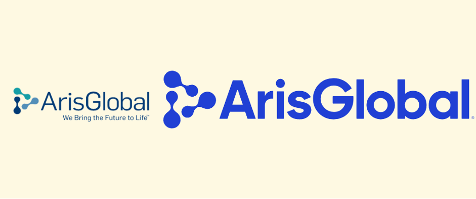
ArisGlobal is the leading provider of life sciences software that automates core drug development functions for over 300 life sciences companies. The company, acquired by Nordic Capital in 2019, shifted from the left to the right-side image, signaling a new era that allures security and trustworthiness.
Key Life Science Logo Design Characteristics
- The unicolor logo presents a strong, simple, and modern image
- The absence of accent colors works favorably toward a minimalist look
- The bold font adds seriousness to the logo, and the vibrant hue of blue falls within the industry’s trends and hints at innovation
- Rebranding – after being acquired, to a vibrant one-color image
- The absence of a tagline adds to the logo’s statement
- ● The robust icon makes for an easy-to-identify symbol
4. Illumina Logo
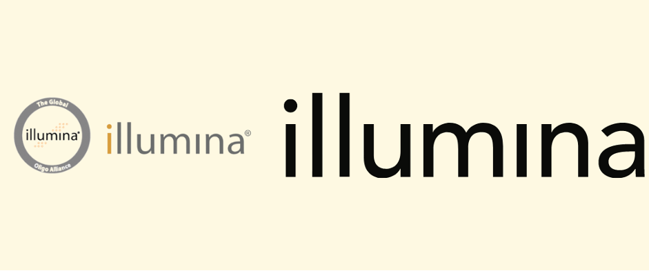
Illumina is a leading developer, manufacturer, and marketer of life science tools and integrated systems for large-scale analysis of genetic variation and function. They’re a global leader in genomics—an industry at the intersection of biology and technology.
From the left to right-, the brand identity shifted towards simplicity, leaving the name at the center of its image, with a bold and modern look.
Key Life Science Logo Design Characteristics
- A minimal logo design consistent with the name of the brand, transmitting a modern, sophisticated image
- The use of a dot only at the first “I” hints at innovation
- The use of a black bold font adds to a futuristic, and innovative feel
- The lack of accent color adds to a slick, elegant look
- Rebranding – towards a slicker image
- The absence of a tagline adds to the logo’s minimal and technological feel
5. Navigating Cancer Logo
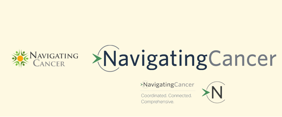
Navigating Cancer was founded in 2008 and has become the leading patient management solution used to care for millions of cancer patients, and through a comprehensive suite of digital oncology, solutions improve the patient experience. As the company has grown into the top leading brand within the healthcare industry, so has its image.
From a saturated brand that feels scattered and outdated – on the left – to a clean brand that offers versatility in its use.
Key Healthcare SaaS Logo Design Characteristics
- The comprehensive logo design incorporates the company’s values while offering alternative images for simplicity
- The main element of the logo is incorporated into the name’s first letter
- The accent color in the arrow icon at the beginning emphasizes forward, innovative thinking
- The tagline can be present or not without altering the logo’s impact
- The font, with a slim use, adds to the brand’s innovative feel
- Rebranding – towards a slicker image with only one accent color
- It transfers easily into social media platforms
6. Novo Nordisk Logo
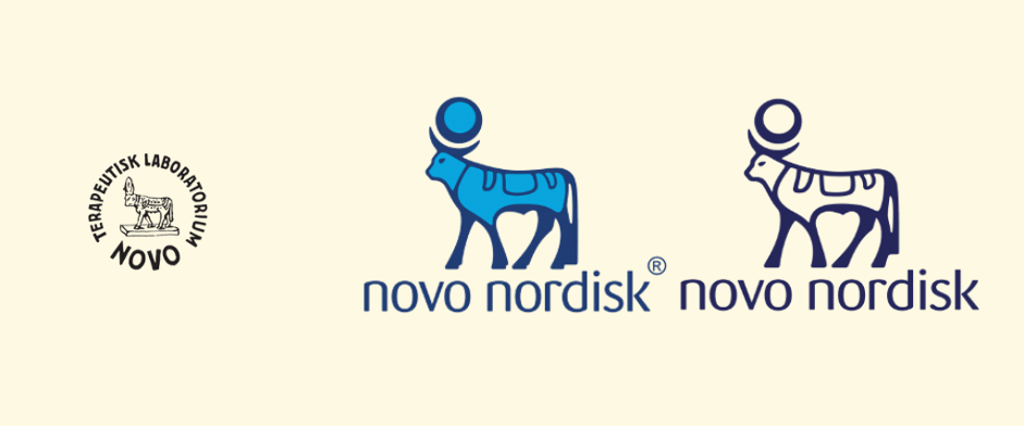
Novo Nordisk is a multinational biotech company based in Denmark that reaches over 100 countries. Novo Nordisk’s original logo design, 1925, shown on the left incorporates the tradition in Europe of identifying pharmacies with an animal symbol, in this case, the Alpis bull.
The new image preserves the company’s history and origins while adding a modern touch with the use of color.
Key Biotech Logo Design Characteristics
- The logo preserves the brand’s origins and incorporates several symbols, like rebirth and growth
- The logotype shows a strong font, in a modern and elegant manner
- The use of two shades of blue reflects security, protection, and stability, while the white adds to a sense of purity
- The alternative logo design – in the far right – offers a polished look for specific content
- Rebranding – to highlight its different business units, designed to emphasize purity, precision, and professionalism
7. Roche Logo
Roche with a 125 history, Roche is one of the world’s largest biotech companies, a leading provider of in-vitro diagnostics, and a global supplier of innovative solutions for multiple diseases. Its logo has been the brand’s image for over 60 years, and its geometric form has become the principal element consumers associate with the company. As a pioneer company, it makes sense they have kept the same, clean image, which has transferred easily into the modern era.
Key Biotech Logo Design Characteristics
- The hexagonal logo preserves a clean image that focuses on the brand’s name while referencing the universe, harmony, and balance
- The soft edge font communicates serenity and trustworthiness
- The use of one muted blue tone transmits calmness, professionalism, and confidence
- The logo has an inverted alternative use for a variety
8. Janssen Pharmaceutical Logo
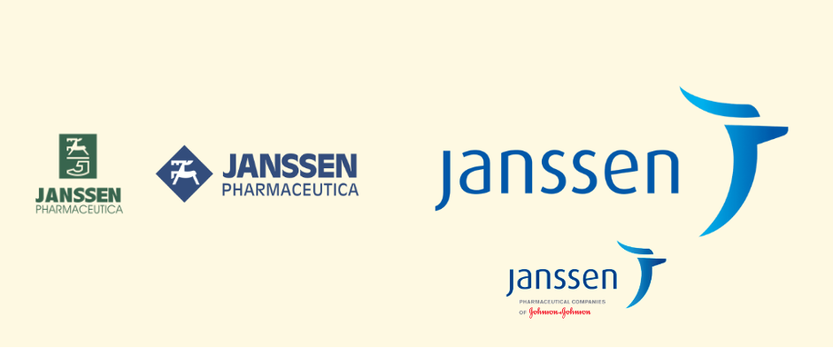
Janssen Pharmaceutical is a Belgian company founded in 1953 and the Pharmaceutical Companies of Johnson & Johnson, since 1961. Their solutions are focused on cardiovascular diseases, immunology, vaccines, infectious diseases, oncology, and pulmonary hypertension. From left to right we can see the brand’s image evolving from a serious tone to a softer look. The current emblem references the company’s deer in the original icon, preserving the brand’s history
Key Pharma Logo Design Characteristics
- The current logo reflects the brand’s history
- The soft font transmits reliability and respect while keeping an elegant look
- The lack of accent colors is compensated by the gradient blue giving a three-dimensional modern feel
- The blue hue symbolizes trust and respect
- Rebranding – In the font, tagline, and changing of colors.
- The tagline can be present or not without altering the logo’s impact
- It transfers easily into social media content
9. Sanofi Logo
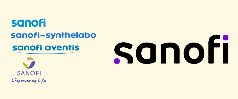
Sanofi is a French pharmaceutical company, that was created after a merger of Elf’s Sanofi and L’Oréal’s Synthelabo. From left to right we can see a drastic transformation in the logo image, with one constant characteristic: a soft font for an innovative and progressive feel. In February 2022, the company announced its most recent rebranding, seeking to unify itself, and encompass both vaccine arm Sanofi Pasteur and specialty care group Sanofi Genzyme. While the new look, takes the company forward, it references the brand’s history by circling back to its first logo: simple, with no tagline or icon. (Top left)
Key Pharma Logo Design Characteristics
- The current logo reflects the company’s revamped ambition and purpose, it showcases innovation, boldness, and growth in line with the brand’s strategy
- The accent colors offer a deeper meaning, as the purple dots symbolize the scientific journey from the idea to the breakthrough, “connecting the dots”
- The main purpose of this logo is to transmit the brand’s humble, authentic, and unconventional values
- Rebranding –in colors, icons, and design, each time to serve a new era of the brand
10. Vertex Pharmaceuticals Logo
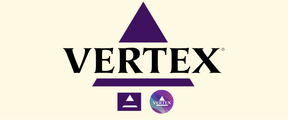
Vertex is a global biotechnology company with big investments in scientific technologies founded in 1989. They’re a specialized company in treatments for rare genetic diseases. The company focuses on the production of cystic fibrosis treatments.
Key Biotech Logo Design Characteristics
- The logo is sharp and elegant, which makes for a timeless image
- The broken triangle symbolizes stability and evolution
- The bold and sharp font adds to a strong and confident look
- The deep purple mixed with the black complements the logo design transmitting power, ambition, and wisdom
- The alternative use we see in their social media maintains its elegant statement while adding a modern look with a multiple-color background.
11. SomaLogic Logo
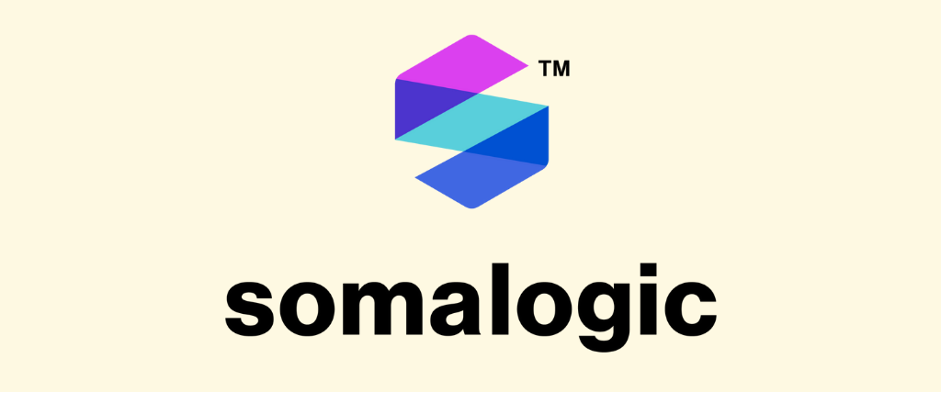
Somalogic, founded in 2000 by Larry Gold has established itself as a leader in proteomics in the last couple of years. It aims to revolutionize the life sciences R&D space with its technology. They offer the largest commercial proteomic assay on the market, providing over 7,000 protein measurements.
Key Life Science Logo Design Characteristics
- The logo is an abstract representation of the letter “S”, and part of an “alpha helix,” a structural feature found in most proteins in line with what the company offers
- The use of light and vibrant colors references innovation, growth, and the young modern history of the company
- The bold font creates contrast, offering a professional and strong image
- The icon offers a range of possibilities for its use and a recognizable trade for users
- It transfers easily into social media content
12. Umoja Biopharma Logo
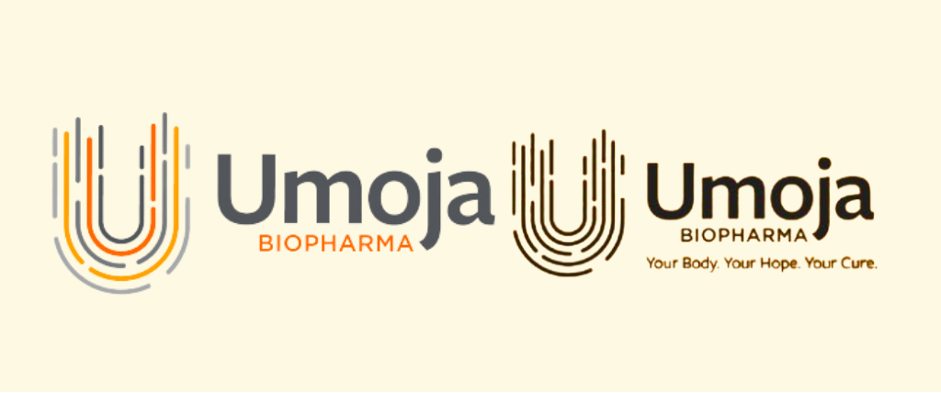
Umoja Biopharma, this brand-new company launched in 2020 and aims to use an integrated approach, uniquely positioned, to transform immunotherapies for cancer. Their technology targets and destroy hematologic and solid organ-based tumors. While this company is breaking into the market, it already has three candidates in preclinical development.
Key Biopharma Logo Design Characteristics
- The logo is simple but makes a clear statement, bold and unified, same as the company’s values
- The light and muted colors offer a mix of hopefulness and seriousness
- The bold font emphasizes the company name, and the soft lines offer a professional look with a reference to modernity and change
- The icon creates a direct reference to the company’s name and references immunotherapies. Its uneven pattern speaks to the new generations
- The tagline “Your Body. Your Hope. Your Cure” can be seen below “Biopharma” in social media content, but does not alter the logo design when it’s absent
Final thoughts
The companies presented in this article offer a wide range of examples of how a logo design and brand can be communicated through their image.
Key paths for the perfect logo design for your brand:
1. Emphasize your name with concrete colors, a strong font, or a minimal icon – Aris Global, Illumina, GSK, Roche
2. Create a logo design that can be deconstructed and serve multiple content creation, with a clear color palette that transmits your values – Navigating Cancer, Janssen
3. Keep it simple but impactful – Somalogic, Vertex, Sanofi
4. Create an emblem that stands out and is easily recognizable – Novo Nordisk, Novartis, Umoja,
If the message connects with the customers you’re set, your logo design will be effective. Keep in mind, that if done correctly, you can always adjust your brand as you grow. Your company logo may need adjustments, and professional logo designers are the best option rather than a logo generator or online logo creator.
Understanding the elements of your own logo is key to ensuring it can evolve as your business does.
Best of luck!


