Healthcare website design trends are evolving at a rapid pace. In today’s digital age, the healthcare industry is at a turning point where it is primed for disruption. This is why designing a modern healthcare website is a fundamental step towards preparing for the digital-first patient experience. Healthcare providers must recognize and adapt their website designs to deliver their healthcare services and boost the digital-first patient experience.
This article will provide you with the ultimate web design guide for healthcare websites. It will help you create a personalized experience that is engaging, easy to use, and meet the need of your digital-first patients. And as a bonus, we have concluded the article with a handy list of some of the most successful healthcare design trends at the forefront of the medical industry’s digital landscape.
What is Healthcare Website Design?
Healthcare website design is a specific web design strategy for developing business websites in the healthcare industry.
It’s essentially a subset in web design in which the content and functionality you apply to a website are optimized for healthcare.
This distinction is important because while healthcare businesses are technical businesses, they’re quite different from other businesses.
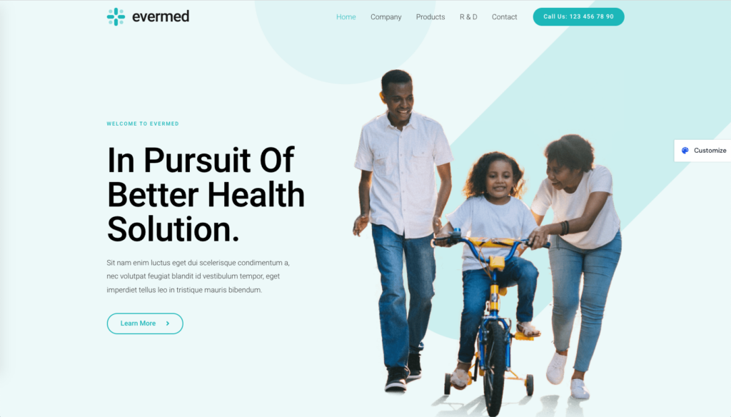
It’s in the way patrons are called “patients” rather than “customers” or the way in which those patients pay for services.
As such, healthcare businesses require a different approach to web design.
What Should a Healthcare Website Include?
So, what elements does a great health care website need exactly? That’s what we’re going to focus on for the next portion of this article.
Scroll down a little further to view a list of top web design trends for medical websites (examples included!).
For now, let’s go over all of the basic parts most healthcare websites should have bit by bit.
Here’s a quick round-up of the things that make up the anatomy of a great healthcare website before we begin:
- Clean, uniform design
- Simple navigation
- Find a provider search function
- HIPAA compliance
- Accessible web design
- Online scheduling
- Online payments
- Business information
- Doctor profiles + Team page
- Patient reviews and testimonials
Clean and Uniform Website Designs
Your website should have a clean design no matter what industry you’re in. It shouldn’t be cluttered with information about your business nor should its styles reflect web design trends used 10 or 15 years ago.
Unfortunately, the healthcare industry is filled with both.
Far too many healthcare businesses clutter their homepages with a list of their services, hours of operation, address and contact information, testimonials, and more, all before you’ve even had a chance to scroll.
Even worse, this layout is paired with outdated color schemes, fonts that are hard to read, and style choices that may make visitors mistakenly lump your site with spam.
As a healthcare business, you may not think your website needs a flashy design, and that’s true for the most part.
What you do need is a design that helps you achieve your business goals, which is where simple web design comes into play.
Use a simple navigation menu, stick with no more than two web-friendly fonts/font styles, and choose colors that match yet contrast well.
The latter tip will make your calls to action stand out better, leading to more appointment requests (or whatever your primary business goal is).
This call to action should also be the only element to appear above the fold, other than your header.
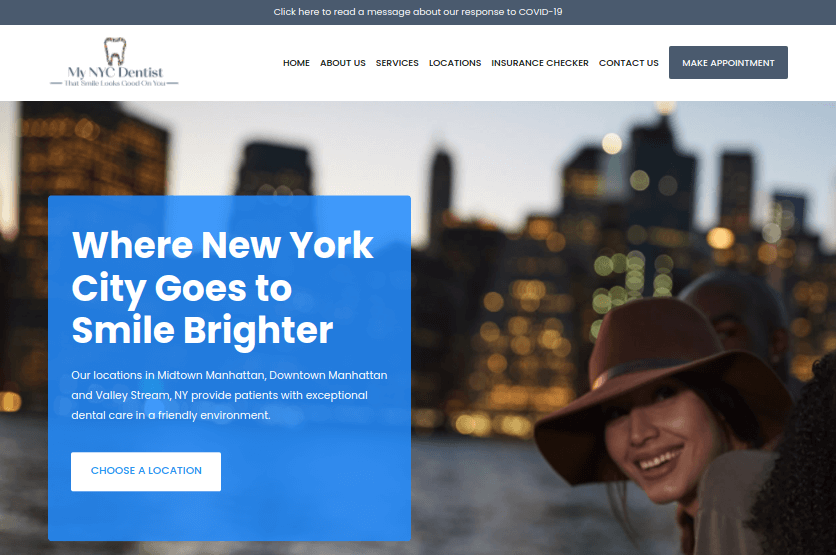
Lastly, use the same (or a highly similar) website layout, styles, and colors across your entire site.
It sets a much better tone and demonstrates the level of care you give to your business.
Simple Navigation & Services Links
You can follow the same rule for your header as you do your website layout: use a design that helps you achieve your business goals.
In the case of your navigation menu, it also helps to know what healthcare customers expect from your business.
This will help you determine what pages to add to your menu.
Most importantly, avoid inserting every page on your website in your main navigation menu. Use your footer for secondary important pages instead, and save your top menu for primary pages.
To be more specific, “primary pages” are pages customers expect to find on your site as well as pages that are important to have for your business goals.
Let’s break both of these down.
Customers expect to be able to find the following information on your site easily:
- Online scheduling
- Online payments
- Billing and insurances you accept
- Services you offer
- Details on providers and other team members in your organization
- Location and contact details
- What to expect during their visit
You can create dedicated pages for each, then place them in your main navigation menu.
Other primary pages you create should be specific to your industry and business goals.
For instance, a dentist may wish to have a gallery page filled with photos of teeth they’ve corrected.
Website Provider Search Function
If your healthcare business only has a handful of providers or less, you can get away with creating dedicated pages for each and listing them in a dropdown menu nested within your larger navigation menu.
Larger organizations, however, should use a provider directory.
A provider directory is an advanced search function that enables patients to use filters when searching for providers. Such filters include areas of medicine, services, location, and even patient rating.
It’s the “find a provider” search function you can find on websites across the entire healthcare industry.
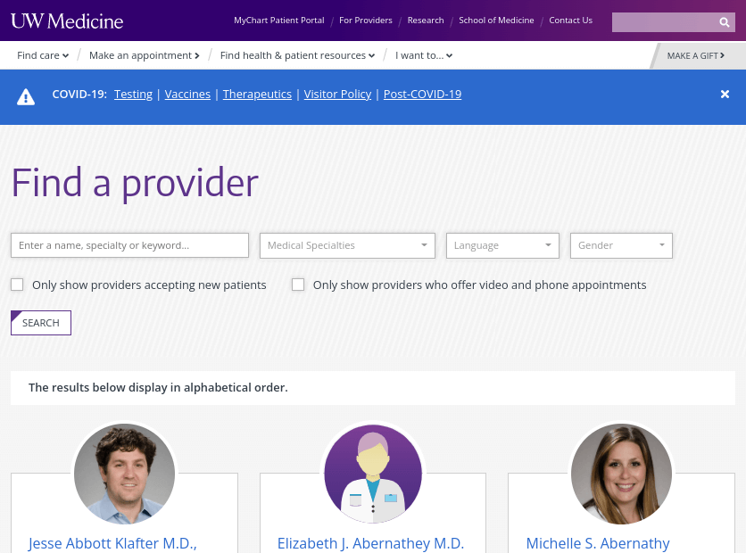
These directories are designed to point patients in the right direction when they visit your website in need of the healthcare services and products you offer, making a directory crucial to your success as it’ll lead to more conversions.
Your web developer can create a directory perfectly tailored for your organization and the specific healthcare niche you’re in.
Otherwise, you (or your developer) can use a third-party provider directory application, such as Symplr, Change Healthcare, Medversant or MetaLocator.
HIPAA Compliance Health Web Designs
HIPAA is the Health Insurance Portability and Accountability Act of 1996. It’s designed to secure protected health information (PHI) by enforcing a set of laws and regulations on healthcare organizations that transfer PHI electronically.
PHI includes patient names, email addresses, addresses, social security numbers, phone numbers, medical records, financial details and even things like images that showcase a patient’s face in full.
HIPAA compliance comes in two forms as it relates to health website designs.
- Ensuring the systems you implement to process data are HIPAA compliant.
- Showcasing the HIPAA seal of approval across your site, usually by placing it in your footer.
HIPAA is regulated by the Department of Health and Human Services (HHS), specifically the Office of Civil Rights (OCR).
If a patient feels you’ve violated their (or someone else’s) rights under HIPAA, they can file a complaint with the OCR who will open an investigation.
From the OCR’s website:
“If OCR determines that a covered entity or business associate may not have complied with the HIPAA Rules, that entity or business associate must:
- Voluntarily comply with the HIPAA Rules
- Take corrective action
- Agree to a settlement
If the covered entity or business associate does not take satisfactory action to resolve the matter, OCR may decide to impose civil money penalties (CMPs) on the covered entity.”
When you design your healthcare website, ensure you use HIPAA-compliant software.
Unfortunately, HIPAA compliance is part of a much larger process that goes beyond web design, a process that includes annual self audits, plans and policies for meeting HIPAA standards, training for employees to be HIPAA compliant, documenting your efforts to become HIPAA compliant, and more.
Accessible Website
Accessibility in healthcare web design refers to the ease in which disabled persons are able to navigate your website.
As a healthcare business, you have a much higher likelihood of having disabled persons visit your website. This makes accessible web designs essential for healthcare businesses.
Not only does accessible web design lead to more conversions from disabled persons, it also ensures your website is compliant with the Americans with Disabilities Act (ADA).
Here are a few ways you can make your healthcare website design more accessible:
- Ensure primary site pages, such as online scheduling, user registration/log in, and online payments, are in your main navigation menu and accessible with the Tab key alone.
- Make entire buttons clickable, not just the text within.
- Use descriptive labels in form fields.
- Avoid using pop-ups, and have pop-ups announce themselves to screen readers when you do.
- Add short yet descriptive alt text to images.
- When choosing third-party software, choose applications with accessible designs.
Online Scheduling for Medical Sites
As we said before, the digital-first healthcare consumer expects to do quite a bit on your website, including scheduling appointments.
This means your healthcare website includes online appointment scheduling. It’ll make the patient experience much more convenient for your customers while also leading to more conversions for you.
To ensure you receive the highest chances of success with this practice, do not require your patient to create an account in order to schedule an appointment.
They should also be able to schedule the appointment in full (by selecting a date and time) from your website. Avoid creating a simple web form your patient can use to request an appointment.
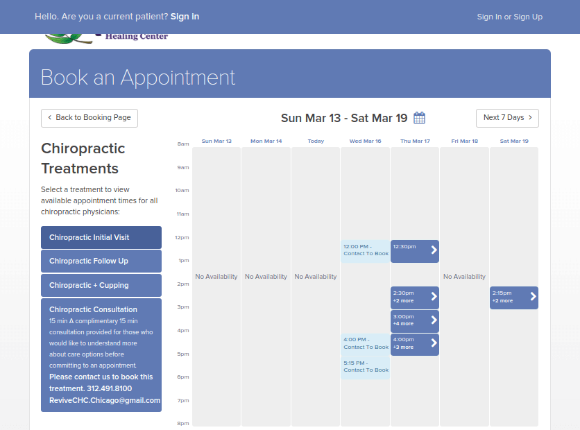
You should also add the “Schedule an Appointment” buttons to your provider directory if you can. Create one for each provider/search result.
As for how to include this functionality in your healthcare website design, this is another functionality your web developer can create and fine tune for your website.
Otherwise, patient scheduling software work great as well.
Lastly, don’t forget to include a call to action for your online scheduling page in your navigation menu. It’s also a great call to action to use in the hero section of your homepage.
Online Bill Pay for Health Insurance
Scheduling appointments isn’t the only thing healthcare customers expect to be more convenient. They’d also like to pay their medical bills without mailing checks or stopping by in person.
The best solution for this is to allow them to pay medical bills online.
The healthcare industry, as you well know, must take a different approach to medical billing than the average industry needs to. This is because it’s an industry filled with hospitals and medical offices that administer critical, life-saving services to customers.
As such, you’ll likely find yourself accepting smaller payments for one bill and creating payment plans for customers.
While you’re developing your medical website design, make sure you include an online billing portal in your plans. Create a dedicated page for it, and insert it into your main navigation menu.
You should create a page titled “Billing and Insurance Information,” or something similar, and use it to explain how the billing process works, which health insurance plans you accept and how patients can pay for their medical bills.
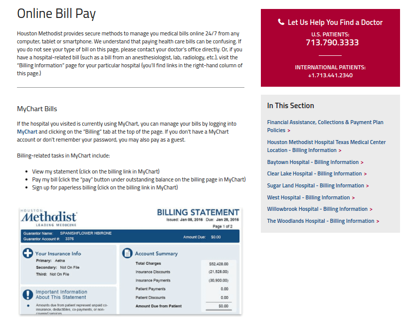
Healthcare customers expect to find this information on your website easily, so be sure to place this page in your navigation menu as well.
As for how to accept payments, hospitals and medical offices can use software like Stax to accept payments online and create customized billing plans for customers.
Otherwise, solutions like Square and Payment Depot work great for one-off invoices.
Business Information
There are a few key business details customers will expect to be able to find on your site.
They include your hours, contact information, and addresses for your locations.
It’s best to insert this information in your top navigation bar as well as your footer, but you can also create a dedicated page for it.
Above all, make sure you have a Contact page that lists your phone numbers and email addresses. You can also include a contact form for customers to fill out.
Live chat is another great feature to add to your medical website. It gives customers quick access to your support team in a convenient way.
Just be sure to use a HIPAA-compliant live chat app.
Doctor Profiles + Team Page
Doctor profiles are like dating profiles for your website. They allow patients to get to know your providers so they can make informed decisions about who they’d like to make an appointment with.
Not unlike dating profiles, adding images to your profile pages is one of the most effective moves you can make with them.
It’s one more way to let patients know what to expect when they come in for their appointments. Plus, a professional image that includes a friendly smile is a simple way to liven up a profile page.
These pages should also include basic information about your providers, including their full names and titles, office locations, and phone numbers.
You should also include a call to action patients can use to schedule an appointment with a particular provider.
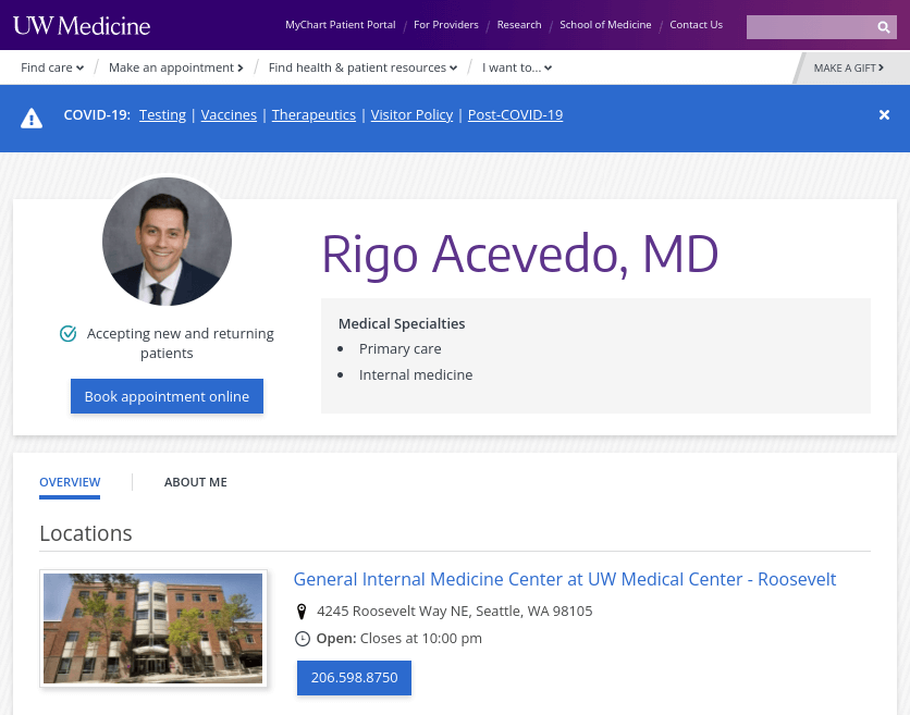
Other details you can add include each provider’s credentials, an overview of their careers, quotes, introduction videos, images of their lives outside of the office, and reviews from patients.
The last element will require integrating a review system into your site. Otherwise, you can simply list testimonials on each provider’s profile page.
Create a central hub page for your providers so visitors can scroll through them quickly. You should also integrate these pages with your provider directory so visitors can learn more about each provider.
Create a separate Team page that includes a collection of smaller profiles for other members of your staff patients may encounter during their visit, including receptionists and nurses.
Include an image for each along with their name and title at the very least. You can get more descriptive than that if you have the time and resources for it.
Patient Reviews and Testimonials
About that review system we mentioned in the previous section: integrating a review system with your site and showcasing reviews patients leave for providers is one of the most effective marketing strategies you can include in your healthcare website design.
It utilizes social proof, a social phenomenon that explains how we’re more likely to perform actions based on the actions of others.
In the case of your medical providers, patients will be more likely to schedule appointments with them if they and your facility as a whole receive positive reviews on a regular basis.
As such, it’s important that you claim your local business listings on platforms like Google, Facebook and Yelp, optimize them, and conduct review management.
You should also integrate a review system on your site so patients can review individual providers.
Lastly, ask customers for testimonials, or simply create testimonials out of reviews.
Either way, showcase them on your homepage, doctor profile pages, and your Services page. You can also use them in marketing materials, such as ads and commercials.
Top 12 Healthcare Website Design Trends in 2022
Your patients expect you to have a quality website that is easy to navigate and aesthetically pleasing. In addition, your website is the first impression they have of your healthcare institution, so it’s essential to nail its aesthetics and portray an image of confidence and professionalism.
In fact, research from Forrester shows that improving the user interface (UI) of your website can increase conversions by 200%, and a quality user experience (UX) can improve conversions by up to 400%.
A quality user experience will not only boost conversions and engagement, but it will also help you rank higher in Google as they plan to release a significant user experience update in 2022.
Therefore, if you want to increase patient volume and quality in 2022, investing in quality website design is essential. About 70% of web designers update their client’s websites at least once every quarter, so it’s vital to have a modern design to keep up with your competition.
We put together a list of some of the hottest medical website design trends that can help you succeed in 2022. Use these website design trends to learn how to improve healthcare marketing performance, boost conversions, and instantly distinguish your company as an industry leader.
1. Minimalism Design
As a healthcare business, it’s essential to project a clean and neat image to potential patients. Therefore, minimalism will certainly be a trend in 2022.
Minimalism also helps a website load faster, which will improve user experience and increase engagement. In fact, research shows that a website that loads in 2 seconds has an average bounce rate of 9%, while those that load in 5 seconds have an average bounce rate of 38%.
Minimalism also provides fewer distractions. By reducing distractions, you can keep the patient focused on your call-to-action (CTAs) and increase conversions.
Doxy.me is a perfect example of a minimalist healthcare web design that maintains the user’s focus and provides an excellent experience.
How to Incorporate Minimalism Design in Medical Sites
To incorporate minimalism, audit your website by looking at these factors:
- Is white the primary color on your website?
- Are there more than two other primary colors on your website?
- Do you use more than three different fonts and font colors?
If your audit reveals that your design could be improved, consider hiring a UX/UI web designer to fix them for you.
You can hire a freelancer from platforms like Upwork, though most freelancers simply follow requests, so you’ll have to spell out exactly what changes you want (change header fonts on pages x,y, and z from Alegreya to Open Sans…). As you can see, this process requires quite a bit of work and design knowledge on your end.
Another option is to hire an agency. For example, from a simple chat, we can get determine the broader vision you’re aiming for, and we’ll handle the design details.
2. Voice User Interface
Almost 40% of millennials already use voice assistants, so it’s no surprise that voice user interface will be a medical website design trend in 2022.
OhioHealth Urgent Care has an excellent example of a voice user interface (VUI) on its website. Their VUI allows patients to ask Alexa about wait times, locations, and more which not only improves patient experience but also cuts down on unnecessary phone calls to the front desk.
However, there are many other ways medical companies can use VUI.
For example, VUI can assist with billing, patient portal support, and prescription refills.
How to Incorporate Voice User Interface in Medical Website
To incorporate VUI, start by analyzing your customer journey map.
A customer journey map shows how potential patients find you and interact with your brand online and offline. When analyzing the customer journey, look at:
- Commonly asked chat, phone and email questions
- Common patient support complaints
- Your current consultation scheduling systems
From there, you can hire a UX designer from Toptal or Upwork to build your VUI.
One tip is to avoid creating a VUI around a question that typically has follow-up questions. Voice is similar to chatbots as it uses artificial intelligence, so it’s best to build a VUI that deals with simple queries like:
- What insurance do you accept?
- When is the next available appointment?
- What is your clinic’s address?
3. Comfortable Colors
Another healthcare website design trend for 2022 is using a comfortable color scheme.
Your website’s color directly impacts how patients view your brand’s personality, so it’s essential to analyze your color selection carefully.
For example, white evokes safety and professionalism. As your main goal is to make your patients feel secure with your brand, you’ll notice that many quality medical websites are designed with white space.
However, other comfortable colors you can use include lighter shades of blue and green. Blue is known for evoking calmness, serenity, and tranquility, while green evokes positive emotions of growth, excitement, and safety (likely due to its association with nature).
Therefore, use comfortable colors across your website and place the most intense colors around your CTA. Using lighter shades will increase the color’s calming effect, so avoid bright or bold colors of any shade.
Baylor Scott and White is a great example of a website that uses mostly light blue and white colors to portray safety, calmness, and professionalism.
How to Incorporate Comfortable Colors for Medical Website
To incorporate comfortable colors into your website design, use a tool like a11y. This tool will show you if you have any colors that are starkly contrasting.
However, as this tool only detects contrast, it’s still important that you eyeball the site. For example, while black and white contrast well, a mostly black website could be intimidating. Therefore, use a combination of both this tool and your own eyes.
4. Bold and Clear Typography
Another design trend that will continue to thrive in 2022 is bold typography. Your website exists to help people learn more about your company, though if your typography is too light or difficult to read, it will frustrate your user and increase your bounce rate.
If you can’t read your web page’s headline from across the room, it probably isn’t bold or large enough.
Your paragraphs should also be large enough to read about two feet from your computer, and they should be no more than a few lines.
In addition, consider using open forms to improve clarity.
While it isn’t necessarily a new font, you’ll likely continue to see a lot more of Sans Serif on medical websites in 2022 as it’s a safe, clear typography that exudes professionalism.
Finally, avoid using more than three different fonts, as too much variety will confuse the reader and harm the website’s aesthetics.
Northwestern Medicine is a great example of a website with bold and clear typography that you can easily read.
How to Incorporate Bold and Clear Typography for Health Web Site
To identify and clean up the typography on your website, install a tool like WhatFont. WhatFont is a chrome extension that allows you to see the font any website is using and its color, weight, and size.
Therefore, if you see a font and typography style on another website that you like, you can then incorporate it into your website.
5. Smart Content Loading
By 2022, you’re already using responsive design, though another more recent trend is lazy loading.
Unlike eager loading, which forces the entire page to load and negatively impacts pagespeed, lazy loading only loads the content the user is currently viewing.
Therefore, lazy loading ultimately improves page speed, which can aid your SEO and decrease bounce rates.
In fact, pages that load within two seconds have an average bounce rate of 9%, while pages that take five seconds to load have an average bounce rate of 38%.
Lazy loading is typically used on pages that have a high volume of images, videos, or other media.
How to Incorporate Lazy Loading for Healthcare Practice Website
Adding lazy loading to your website is likely something you’ll have to send to a developer, though you can check if your website has lazy loading on your own.
Simply scroll down and watch if the images load as you scroll. If you currently have eager loading, the page will probably take a while to load and then shows all of the images without delay.
Insert GIF https://blog.hubspot.com/website/lazy-loading-eager-loading
6. Add Human Elements
While advancements in online communication have made it possible to complete most interactions online, many patients now miss the personalization of live interactions and often feel more like numbers than humans. In addition, the Coronavirus pandemic has added to the sense of alienation. As a healthcare provider, it’s more important than ever to make the website appear human.
One of the easiest ways to make your website look more human is to add a real image of a patient or medical professional to the homepage.
In fact, research shows that pictures of people’s faces can dramatically increase engagement.
However, it’s important to use a real photo of an employee or patient (with their name) as original images generate 35% more conversions than stock photos.
Children’s National is a great example of bringing humanity into healthcare focused web design.
How to Incorporate Human Elements to a Healthcare Website
If you have a large website (for example, a hospital website), start by looking at just the main pages. Place the image at the top of the page (typically on the banner) as most people never scroll to the bottom.
An ideal image would be a patient and staff member interaction. If you don’t have any at the moment, see if you can get someone to take some pictures and send them to you. You can then edit it with a tool like Canva to create a banner of the patient/employee like the one above.
7. Purposeful Microinteractions
Microinteractions are a major healthcare website design trend for 2022. They are a great way to engage your visitor and add an extra level of professionalism to your website.
For example, if you have a page that loads slowly, you can create an entertaining page that keeps users engaged and reduces bounce rates:
Another example of a micro interaction is the animated chat bubbles when someone is typing to you. This gives you peace of mind and keeps you engaged rather than waiting impatiently, and ultimately leaving the website.
Here’s an example of a micro interaction that also helps increase time on site and engagement by showing the reader what to do next (read the next post).
Microinteractions shouldn’t be noticeable or distract the user from what they are looking for on your website. Rather, they exist to interest the reader and increase engagement.
How to Include Microinteractions with Medical Design
Creating micro-interactions is very easy. You can use tools like Principle, Framer, or Flinto to transform any image or graphic into an animated micro interaction.
Once you become comfortable using these apps, it typically only takes a few minutes to create a micro interaction. However, don’t abuse the tool and make the website cluttered with meaningless animations. Use it sparingly and only for key places where readers bounce.
8. Stacking Slides
While it used to be trendy to have a slideshow on your healthcare center’s homepage, you’ll see far fewer websites with rotating slides or rotating carousels in 2022. Visitors are conditioned to scroll rather than click through slides, so most patients never see your second slide.
In fact, plenty of studies show that these slides frustrate visitors because they can’t immediately find what they need.
Instead, stacking slides will be the new medical website design trend in 2022.
Baptist Health has a great example of stacking slides.
To determine if people are using your carousels, you can install a heatmap like Hotjar or Crazyegg and watch as people interact with your website. If you notice that none of them stop to scroll through your carousels, it’s a good idea to turn those slides into stacked slides.
How to Incorporate Stacking Slides to Healthcare Websites
Rather than redesigning your entire website, simply take the carousel or sliders you currently have and move them down the page.
You can break it up with white space to create a more minimalist design. Or, if you find that some of your slides don’t add value, you can delete them altogether.
9. Tall Pages
Another web design trend that is returning for 2022 is tall pages. Replacing shorter pages or paginated pages with a tall page is particularly important for conversion-related pages, like a procedure page.
Rather than creating pages that offer bite-sized chunks of information, tall pages enable you to answer all of the visitor’s questions in one location rather than making them find various other pages on your website.
CrazyEgg has a famous case study where they replaced a short page with a tall page that was 20 times longer. As a result, their conversions increased by 30%.
You can see that many service pages, such as this one, offer virtually all the information a patient could possibly want on the subject without ever needing to click elsewhere.
In addition, longer pages (that are more thorough) tend to rank better on Google, so you’ll enjoy a nice SEO boost by combining relevant pages.
How to Incorporate Tall Pages to Healthcare Design
Consider combining multiple thin pages into one tall page on a topic and adding a table of contents to the page.
For example, rather than having multiple pages on breastfeeding, this guide has a table of contents and covers every topic imaginable on breastfeeding.
Fortunately, adding a table of contents is very easy with the Fixed TOC plugin. Once you’ve installed the plugin, it’s very easy to use. Go to:
Settings > Fixed TOC > General > (select your post, heading levels, TOC location)
10. Personalized Experiences
About 35% of consumers are more likely to make an unplanned purchase if they receive personalized content. Therefore, personalization will be a major web design trend well into 2022.
A very simple example of personalized web design is simply adding other relevant links to each page to lead the customer through the buyer’s journey.
For example, if a patient finished reading a guide to rhinoplasty, they might also be interested in a page with before and after photos.
You can also do more advanced personalizations, such as showing dynamic content based on what the user searched. For example, if the person searched for “kids cancer treatment,” you can have the header image change from an adult to a child and change the messaging.
How to Create a Personalized Experience for Your Patients
The best way to incorporate personalization is by using a plugin called If-So, which offers a variety of different features.
One of its most popular features among marketers is its ability to detect the website visitor’s city and automatically incorporate the city name into the copy on your website.
In addition, it can also segment users. For example, you can show a “start a free trial” CTA to users that have never visited your website and a “20% Discount” CTA to users that have landed on your website.
This app can also serve dynamic content based on the visitor’s Google search query.
11. Embedded Videos
About 72% of consumers said they would prefer to watch a video than reading text to learn about a product or service, so it’s no surprise that embedded videos will be a website design trend for 2022.
Videos are wonderful tools to teach patients about specific services (like a procedure), though they can also be used on the homepage to engage the visitor immediately.
Englewood Healthcare Medical Center website has an excellent example of an embedded video for the homepage.
As you create these videos, be sure they don’t slow down your website’s page speed. Therefore, ensure your video is HTML5 compatible before you upload it and consider using a compressor plugin. You can learn more about how to do that in this guide.
When you upload your video, have it set to play automatically, though make the user click for sound. This will increase engagement, though it won’t annoy your users.
How to Incorporate Embedded Videos to Your Health Site
As most people now work remotely, creating a massive video production likely isn’t an option. However, you can use a simple application like QuickTime to create a screen recording. Just open QuickTime and go to:
File > New Movie Recording > Record
When you’re done recording, just hit stop and save it to your computer.
For editing, you can use software like iMovie, which is free on a mac. Typito is another great video editor that also has a free plan and can be used on any computer.
12. Captivating Questionnaires
The final healthcare website design trend for 2022 is creating captivating questionnaires like quizzes.
Rather than making customers search your website, serve the information they want directly to them.
For example, depending on your patient’s quiz answers, you can automatically route them to relevant content. In addition, studies show that quizzes are very engaging as up to 96% of people that start a quiz finish it.
Helix Sleep has a great example of how a web designer can funnel people into an interactive quiz to increase engagement.
How To Incorporate Captivating Questionnaires to Your Website
Creating questionnaires or quizzes is very easy (and cheap) with tools like Typeform, Qzzr, Quiz-Maker, and more. Each quiz comes with an embed code that you can easily give to a developer to add to a blog post or main page.
You can create multiple-choice, free responses, and other quizzes to engage patients.
Here’s an example of a Typeform MedTech quiz.
Patient’s expectations of digital experiences have risen over the past several years, and the healthcare website designs trends for 2022 reflect this pattern. In addition, with so many easy-to-use design tools available, your competitors will continue to refine their designs.
Therefore, if you want a professional, sleek website that delivers an amazing user experience and exists on a different level from the competition, contact us today for a free consultation.
Conclusion
Healthcare website design is a difficult web development niche to master but highly rewarding when you do.
The most important thing any medical website you create must do is offer convenience for digital-first healthcare consumers who expect it most.
The most effective way to do this is to integrate online appointment scheduling and payment systems into your website and make sure patients can access them easily from your navigation menu.
Your website should also use modern web design styles that work for your marketing goals with minimalist designs and contrasting colors.
This approach works great for the call to action you use on your home page, which should be a request for your visitor to schedule an appointment more often than not.
Something we didn’t mention in the article is the importance of hosting your website on a capable server owned by a reputable hosting provider.
Our top picks are the managed and unmanaged servers offered by HIPAA-compliant hosts like Atlantic.net, Liquid Web, and Rackspace.
Lastly, make sure your web design is accessible, and monitor your performance regularly.


